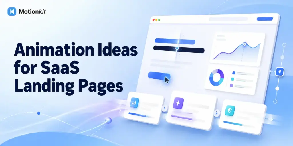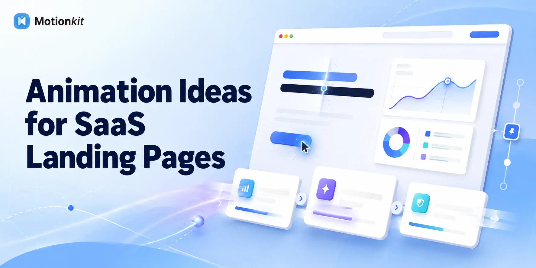
A SaaS landing page gets one chance to turn an unfamiliar visitor into a new user or qualified lead. Clear messaging starts that journey while purposeful animation keeps it moving. The right motion draws attention to key benefits, demonstrates how the product works, strengthens trust and guides visitors toward the call to action. Poorly planned animation does the opposite. Slow hero entrances, spinning icons, and excessive effects can hide the message and frustrate visitors.
This guide breaks down practical animation ideas for every important SaaS landing page section, including the hero, product visuals, features, social proof, pricing, and final CTA. You will also learn how to build these effects in WordPress without coding using GSAP-powered tools such as MotionKit.
The best SaaS landing page animations guide attention and reinforce the message rather than decorate.
Animate the hero headline (split-text reveal) so the value proposition lands first, bring the product UI in with a subtle entrance, reveal feature cards on scroll, count up key stats for social proof, and add small hover feedback on CTAs and pricing.
No-code GSAP tools like MotionKit let you build all of this in WordPress without JavaScript.
Why Animation Works Especially Well on SaaS Pages
SaaS products are often abstract. Unlike an e-commerce page selling a physical object, a SaaS page is selling software, workflows, and outcomes that a visitor can’t hold or immediately picture. Animation helps make the abstract concrete: showing a product UI in motion, animating a before/after, or revealing how a feature works communicates value that static screenshots struggle to convey.
SaaS pages are also long. A typical landing page scrolls through a hero, features, social proof, pricing, and a final CTA, and the biggest risk is that visitors lose momentum and drop off partway. Scroll-triggered animation directly counters this: each reveal is a small reward that pulls the visitor to the next section, keeping them moving toward the signup instead of bouncing halfway down.
Animation Ideas by Section
Rather than a generic list, here are animation ideas mapped to each part of a SaaS landing page with the job each one does.
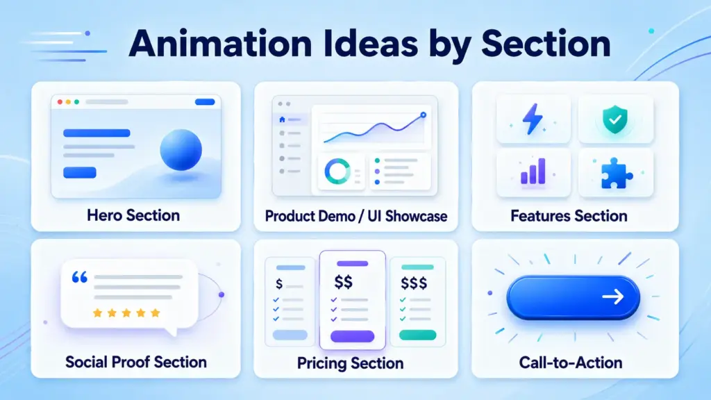
Hero Section
The hero decides whether visitors stay, so it’s the highest-leverage place for motion, and the easiest to overdo.
- Split-text headline reveal – Animate your main value proposition in word by word or line by line so it draws the eye and lands first. This ensures visitors actually read the one line that matters most.
- Staggered entrance – Bring the headline, subheading, and CTA in sequence (headline first, then sub, then button) so the eye follows the intended order.
- Subtle product UI float – If your hero includes a product screenshot or mockup, a gentle float or fade-in adds life without delaying comprehension.
Avoid: Long, slow hero animations that make people wait to read. Keep it fast, the message should be legible almost immediately.
Product Demo / UI Showcase
This is where SaaS animation earns its keep showing the product in motion.
- Animated UI walkthrough – Reveal parts of your interface in sequence to show how the product works, or animate a cursor performing a key action.
- Before/after reveal – Animate the transition from problem state to solution state to make the value obvious.
- Feature-in-context motion – A short looping animation of a core feature doing its thing communicates more than a static screenshot.
Avoid: Heavy video or huge assets that load slowly, use optimized, lightweight motion so the demo doesn’t tank your load time.
Features Section
Features are where scroll animation keeps momentum going.
- Scroll-triggered card reveals – Fade or slide feature cards in as the visitor scrolls to them, giving each benefit a moment of attention.
- Staggered grid – Reveal a grid of features with a slight offset between items so they cascade in rather than appearing all at once.
- Icon microanimations – Small, subtle icon movements draw the eye to each feature’s point.
Avoid: Animating every feature aggressively, subtle and staggered beats flashy here.
Social Proof Section
Motion makes proof more persuasive and memorable.
- Animated counters – Numbers that count up (users, uptime, savings) as they enter view make stats feel significant instead of static.
- Logo reveal – Fade in customer or integration logos on scroll to reinforce credibility.
- Testimonial slide-in – Bring quotes in gently as the visitor reaches them.
Avoid: Fast auto-rotating carousels that move before people can read them.
Pricing Section
Small motion here reduces friction at a high-stakes moment.
- Pricing card entrance – Reveal plans on scroll, optionally emphasizing the recommended tier with a subtle highlight animation.
- Animated monthly/annual toggle – A smooth transition when switching billing periods feels responsive and modern.
- Hover lift on plans – A gentle lift on hover makes the cards feel interactive and clickable.
Avoid: Anything that makes pricing feel hard to read or slow to interact with clarity beats cleverness at the moment of decision.
Call-to-Action
The CTA is where every animation choice should ultimately point.
- Button microinteractions – A responsive hover and click state removes hesitation and confirms the action registers.
- Attention-guiding motion – A subtle entrance or gentle pulse on the primary CTA (used sparingly) draws the eye to the next step.
Avoid: Aggressive or constant CTA animation that reads as pushy or spammy.
SaaS Landing Page Animation Cheat Sheet
| Section | Recommended Animation | Job It Does | Watch Out For |
| Hero | Split-text headline + staggered entrance | Land the message first | Slow reveals that delay reading |
| Product demo | UI walkthrough / before-after | Make the abstract concrete | Heavy assets, slow load |
| Features | Scroll-triggered staggered reveals | Keep scroll momentum | Over-animating every item |
| Social proof | Animated counters + logo reveal | Make proof memorable | Fast auto-rotating carousels |
| Pricing | Card entrance + billing toggle + hover | Reduce decision friction | Hurting readability/interaction |
| CTA | Button microinteractions | Confirm and guide action | Pushy, constant motion |
Use this as a starting map, then keep only the animations that genuinely help each specific page.
Examples and Use Cases
Seeing how these combine on real SaaS pages makes the plan concrete.
An early-stage startup launching a landing page – Keep it lean: a split-text hero headline, a floating product screenshot, scroll reveals on three feature cards, and animated signup counters for social proof. Enough motion to feel credible and modern, not so much that a small team spends weeks building it.
A B2B SaaS explaining a complex product – Lean on the product demo section, an animated UI walkthrough and a before/after reveal, plus a pinned section that walks through the workflow as the visitor scrolls. Here animation does real explanatory work for an abstract product.
A SaaS running a paid-traffic campaign page – Every animation points at conversion: fast hero, momentum-keeping feature reveals, animated proof, and a CTA with clear hover feedback. Motion is tuned to reduce drop-off between ad click and signup.
A product-led SaaS emphasizing the interface – Make the product UI the star, animate it in the hero, show features in context with looping micro-demos, and use hover states that mirror the app’s own responsiveness so the page feels like an extension of the product.
The consistent principle: on a SaaS page, every animation should either help the visitor understand the product or move them toward signing up. Motion that does neither is the first thing to cut.
Benefits of Animating a SaaS Landing Page
Animation on a SaaS page produces measurable results, not just a nicer look.
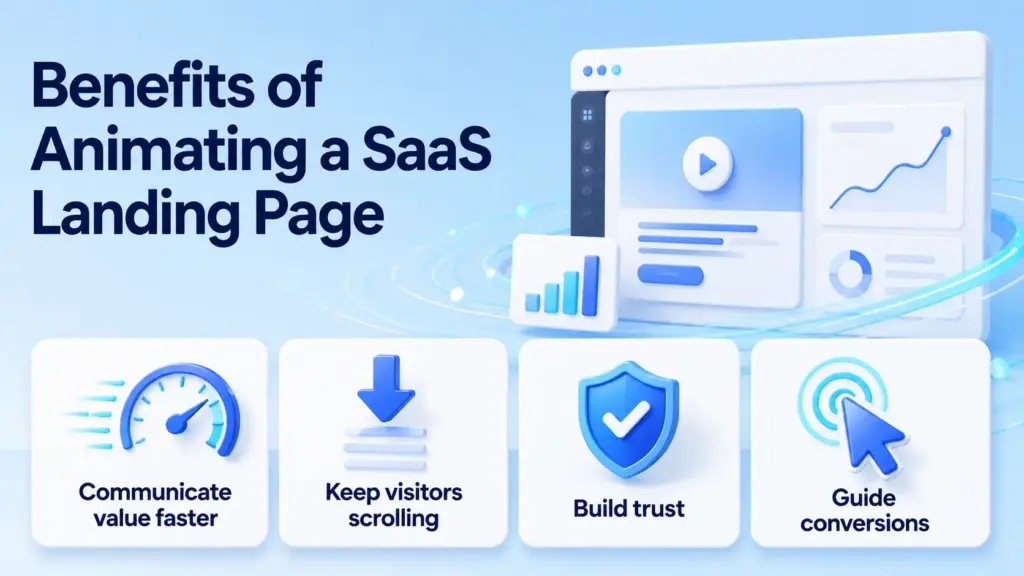
You communicate value faster because motion makes an abstract product concrete, showing what static screenshots can only describe. You keep visitors scrolling because each scroll reveals pulls them toward the CTA instead of letting them drop off on a long page. You build trust because a polished, responsive page signals a well-built product, which matters when someone is deciding whether to sign up. And you guide conversions because purposeful motion directs attention to your message, your proof, and your call to action in the right order.
For founders and product marketers, that translates into the metric that matters: more signups and demos from the same traffic. For designers building SaaS sites, animation is increasingly what clients expect and what separates a page that converts from one that just looks fine.
Common Mistakes to Avoid
SaaS pages fall into a predictable set of animation traps.
Slow hero animation – Making visitors wait to read your value proposition costs you the ones who bounce in the first seconds. Keep the hero fast and legible.
Animating everything – When every section and element moves, nothing stands out and the page feels chaotic. Motion should highlight, not saturate.
Heavy product-demo assets – Large uncompressed videos or images for the demo slow the page and hurt conversions. Optimize and lazy-load.
Auto-rotating proof that moves too fast – Testimonials and logos that rotate before people can read them waste your social proof. Let visitors control or read at their own pace.
Distracting from the CTA – Animation everywhere competes with the one action you want. Every effect should ultimately support conversion, not pull attention from it.
Ignoring mobile and performance – SaaS traffic is heavily mobile and often from ads, so a laggy animated page burns budget. Simplify motion on mobile and keep it fast.
How MotionKit Helps
Most of these ideas, split-text hero reveals, scroll-triggered feature cards, pinned product walkthroughs, animated counters, hover states, are GSAP-powered effects, which historically meant hiring a developer to build your SaaS landing page. MotionKit removes that requirement.
MotionKit brings GSAP animation to WordPress through visual controls, so a founder, marketer, or designer can build a fully animated SaaS landing page without writing JavaScript.
You can add a split-text headline to the hero, reveal feature cards on scroll, pin a section for a product walkthrough, animate stat counters, and add hover feedback to pricing and CTAs, all with settings instead of code. Because it’s built on GSAP, the motion stays smooth and fast, which matters on a conversion page where lag costs signups.
MotionKit won’t design your conversion strategy or write your copy, but for turning a static SaaS page into an animated one that guides visitors toward signup, it covers the motion without the code.
Last Thoughts
Animation on a SaaS landing page isn’t about looking impressive, it’s about doing two jobs better: making an abstract product concrete and keeping visitors moving toward signup on a long page.
The trap SaaS pages fall into is treating animation as decoration and adding it everywhere, which buries the message and distracts from the CTA. The fix is a single rule applied to every effect: does this help the visitor understand the product or move toward signing up? If not, cut it.
FAQs
The most effective are a split-text hero headline reveal, a subtle product UI entrance, scroll-triggered feature card reveals, animated counters for social proof, and hover feedback on pricing and CTAs. Each should guide attention or explain the product, not just decorate the page.
Yes, when they’re purposeful. Animation makes abstract software concrete, keeps visitors moving down a long page toward the CTA, and signals a polished, trustworthy product. The key is that every effect supports understanding or conversion; decorative motion that distracts can hurt.
A split-text headline reveal paired with a staggered entrance of the headline, subheading, and CTA works well, it lands your value proposition first and guides the eye in order. Keep it fast so visitors can read immediately rather than waiting for a slow reveal.
Use optimized, lightweight motion instead of heavy video, animate a UI walkthrough or a before/after reveal, and lazy-load any assets so they don’t compete with initial load. GSAP-based animation using transform and opacity stays smooth without dragging performance.
Yes. No-code tools like MotionKit bring GSAP-powered animation to WordPress, so you can build hero reveals, scroll-triggered features, pinned product walkthroughs, and animated counters using visual controls instead of writing JavaScript.
If the motion is distracting from your message or your CTA, there’s too much. A good rule is to animate only what helps a visitor understand the product or move toward signup, keep it fast, and cut anything that’s purely decorative. When everything moves, nothing stands out.